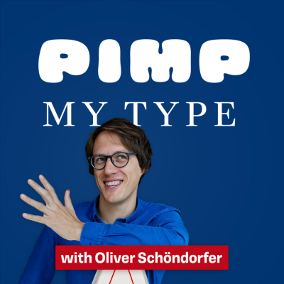
Pimp my Type
Podcast de Oliver Schöndorfer
Empieza 7 días de prueba
$99.00 / mes después de la prueba.Cancela cuando quieras.
Más de 1 millón de oyentes
Podimo te va a encantar, y no estás solo/a
Rated 4.7 in the App Store
Acerca de Pimp my Type
Learn how to use typography to boost your design projects and communicate their messages better! I’m your host, Oliver Schöndorfer, UI designer and typographer. This podcast offers the audio version of long format expert interviews from the YouTube Channel Pimp my Type, that not necessarily have to be watched.
Todos los episodios
11 episodiosWith so many options out there, font licensing can feel like a headache! But it’s critical to understand it before choosing a typeface. That’s why I’m thrilled to welcome Joyce Ketterer, CEO of Darden Studio and expert on font licensing, to help us untangle it all. We discuss Among answering listener questions, we discuss: The most common commercial font license models and how to choose the right one. The differences between open-source fonts and commercial options. Whether using Google Fonts or Adobe Fonts is really safe What designers and developers need to know before selecting a font. The risks of skipping proper font licensing — and how to avoid them. Talking Points: 06:34 – Fonts Are Licensed, Not Purchased 08:45 – Restrictions on System Fonts 12:08 – Adobe Fonts and Licensing Challenges 14:42 – Using Fonts for Logos and Glyphs 18:07 – Software vs. Intellectual Property Licensing Models 26:36 – Free vs. Licensed Fonts 30:08 – Why Foundries Price Fonts for Companies 39:01 – Perpetual vs. Timed Licenses 44:17 – Licensing Fonts for Apps, Websites, and E-books 56:07 – Embedding Fonts in PDFs 58:19 – Contacting Foundries for Guidance 📝 Show notes and comment here: https://pimpmytype.com/talk09 [https://pimpmytype.com/talk09] 📞 Book your typographic coaching call: https://pimpmytype.com/coaching-call [https://pimpmytype.com/coaching-call/]
Web accessibility is an afterthought or a technical thing for many designers. At least I saw it that way before I embarked on my accessibility journey. But It’s during the design process when crucial decisions are made – and these go a long way! So to give designers some practical tips, I invited web accessibility expert Mina Nabinger [https://www.instagram.com/mina_malism/] to join me in a fun talk. We discuss What you should pay attention to as a designer, covering things like: * Why accessibility matters and is not just a checklist, * The legal landscape, especially in the EU, * the most critical issues for visual designers, * How much accessibility is needed vs. nice to have, and * Balancing accessibility with aesthetics. Talking Points: 04:09 – Mina’s Background in Accessibility 06:47 – Why Accessibility Matters 08:22 – Relevance of Accessibility for Visual Designers 10:52 – Top Accessibility Issues in Visual Design 13:34 – Accessibility as a Continuous Process, Not a Checklist 15:05 – Critical Issues in Visual Design Accessibility 21:42 – Legal Landscape of Accessibility in the EU 26:08 – Icon Buttons Without Labels 29:24 – Challenges with Moving Images and GIFs 32:11 – Links in Paragraphs and Touch Targets 37:50 – Outdated Icons: Do They Still Work? 40:25 – Writing Accessible Call–to–Action Buttons 43:26 – How Much Accessibility is Needed vs. Nice to Have? 47:05 – Balancing Accessibility with Aesthetics 50:48 – Screen Resolution and Text Size for Accessibility 56:00 – Final tips for visual designers 📝 Show notes and comment here: https://pimpmytype.com/talk08 [https://pimpmytype.com/talk08] 📞 Book your typographic coaching call: https://pimpmytype.com/coaching-call [https://pimpmytype.com/coaching-call/]
Are the fonts you pick actually any good? And I don’t mean if they fit the topic or the aesthetics of your project. I mean the quality of the actual font. Is it well-made? To help us with that, I invited type designer Alanna Munro. You will learn: * How Alanna combined a passion for gaming with type design. * The problem with marketplaces * The three most important things to check if it's a quality letterform * About optical illusions and type design * What curve speed is * The difference between a font and a typeface * We assess five fonts, going from bad 😕 to horrible 😱 Alanna Munro is an independent type design and lettering artist from Vancouver, Canada. To me, her typefaces incorporate something playful while never losing their utilitarian purpose. She caught my attention with her type design livestreams [https://twitter.com/alannamun/] on Twitch and recently with her Letter Nerd [https://alannamunro.com/shop/letter-nerd-volume-one/] publication. In a little 16-page booklet, Alanna gives you a quick overview on how to design and spot if it's a quality letter. 📝 See the examples and show notes here: https://pimpmytype.com/talk07/ [https://pimpmytype.com/talk07/] 📞 Book your typographic coaching call: https://pimpmytype.com/coaching 01:44 – Welcome, Alanna Munro 05:39 – Type design for video games 09:06 – What’s a good font? 18:10 – Three most important things to check 24:03 – Optical illusions in type design 29:30 – Bad font #1 36:03 – Bad font #2 40:57 – Bad font #3 43:55 – Bad font #4 46:06 – Bad font #5 (worst!) 47:42 – Difference between font and typeface 49:19 – Final tips 53:28 – Closing
What makes an accessible typeface? And how can we improve typography in regard to web accessibility? To answer this and other questions, I invited type designer Eleni Beveratou, creative director at Dalton Maag. We discuss: 🔵 The difference between legibility and readability 🔵 What makes an accessible typeface? 🔵 If Arial and Comic Sans are really superior? 🔵 If we should use designated fonts for dyslexic people in our designs more often? 🔵 How you can mess up the most accessible typeface by using it inaccurately. 🔵 If you should avoid italics or centered text? 🔵 And, if ligatures are helpful or can be problematic? This was recorded as a fun an easy-going live stream on YouTube [https://www.youtube.com/watch?v=oaj7aItkj14]. If you want so see the visuals, maybe check out the video as well, but I think for the most part you will be good to follow along. 📝 All Show Notes [http://pimpmytype.com/talk06] https://pimpmytype.com/talk06 📞 Book your Typographic coaching call [http://pmty.pe/coaching-call] Talking Points: 0:03:00 Why Eleni got interesting in Accessibility 0:05:00 Accessibility is not only for the blind 0:09:10 How reading works 0:12:30 Accessibility is Legibility, Readability, Likability 0:17:00 What makes an accessible typeface? 0:28:15 Sans-Serif vs. Serif fonts 0:35:00 Are accessible fonts always the same? 0:42:45 Should we avoid very expressive fonts? 0:46:45 Fonts for dyslexia 1:02:50 Making accessible fonts inaccessible 1:07:15 Text Contrast: Light on Dark, Dark on Light 1:14:00 Use italic text sparingly 1:16:50 Tracking fonts 1:21:00 Avoid centered text 1:25:35 Are ligatures problematic or helpful? 1:30:00 Be careful with Guidelines 1:32:00 Closing
Typography for print can be intimidating to many designers, especially when you focus on digital mostly. This is why I invited specialist Diana Varma to share her knowledge of what to pay attention to when dealing with type for print. You will learn: 🤩 The advantages of print over digital. 🤩 The differences between readability and legibility. 🤯 The right font sizes & smallest type size you can print (blew my mind). 🤩 How to avoid beginners mistakes in prepress. 🤩 How to best print gray text? 🤩 Accessibility is also a topic that comes up quite a lot during this talk. Talking Points 02:19 Greetings to Diana Varma 06:09 How Diana’s podcast got started 09:13 Advantages of print typography 14:35 Ideas for digital/analog hybrids 17:02 Type choice for long reading formats in print 22:12 On point and pixel sizes 26:00 Basic tips for print beginners 33:04 How to best print gray text 36:59 Knowing the fundamentals to break the rules 39:07 What fascinates Diana about typography? 41:11 Why Diana prefers Comic Sans over Papyrus 43:08 Easter eggs on Diana’s website 📝 All Show Notes [https://pmty.pe/talk05 ] + Video of the talk 🎙️ Diana’s Podcast Talk Paper Scissors [https://talkpaperscissors.info] ▶️ Video: How to choose a good typeface for body text [https://youtu.be/Pg5Nq8MAyvs ] 📞 Book your Typographic coaching call [http://pmty.pe/coaching-call ]

Rated 4.7 in the App Store
Empieza 7 días de prueba
$99.00 / mes después de la prueba.Cancela cuando quieras.
Podcasts exclusivos
Sin anuncios
Podcast gratuitos
Audiolibros
20 horas / mes
